Diversity, Inclusion, Continuous Innovation, and Adaptability
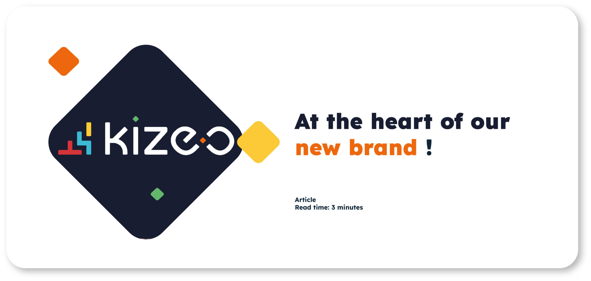
At the heart "
of our New Brand "
We are proud and excited to introduce Kizeo’s new brand identity. This fresh identity aligns with our goal to provide our clients with a consistent experience, helping them better understand who we are and what we stand for.
Our new logo not only embodies our ongoing evolution but also our unwavering commitment to innovation and our determination to push boundaries, no matter the challenges that come our way.
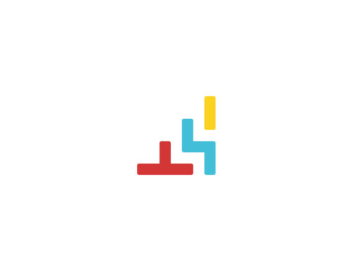
1. The Tetris Block: Symbol of Modularity and Adaptability!
The concept of modularity is of paramount importance, signifying the flexibility and versatility of our Kizeo Forms and Kizeo Tempo solutions. This feature serves as a key indicator of our products’ ability to seamlessly integrate with the needs of our users.
In the context of our B-to-B application suite, modularity encompasses the ability to customise and configure functionalities according to each company’s or industry’s specific requirements. This flexible approach allows our clients to shape their own workflows and processes by incorporating only the necessary elements, while leaving room for the integration of new features over time.
In summary, the concept of modularity within our logo is more than just a technical aspect; it is a strategic focus that guides our commitment to providing intuitive, scalable, and tailored solutions.


2. The Infinity Symbol: A Commitment!
At the core of this transformation is a symbol representing Kizeo’s fundamental philosophy: the letters “E” and “O” intertwine to form an endless loop, symbolising infinity. This timeless shape reminds us that opportunities for progress and improvement are limitless. Just as the loop has no end, we firmly believe that our potential for innovation and excellence is infinite, regardless of the circumstances.
As passionately expressed by our CEO, Philippe Gellet: “Innovation is the engine of success, and success cannot be achieved without the courage to constantly push boundaries.” This conviction is now reflected in our logo. The infinite loop visually reminds us that, even in a constantly changing world, we persevere with determination and always strive to surpass our past achievements.
This symbol goes beyond aesthetics; it embodies our commitment to our team and clients.
3. An Explosion of Colours:
Kizeo’s colourful logo holds deep meaning in representing multiculturalism. Each color that makes up the logo tells a story, symbolising the essence of diversity and unity within the company.
The colours reflect the richness of cultures and backgrounds within the Kizeo team, with more than 12 different nationalities. Together, they form a harmonious mosaic, celebrating collaboration and cooperation among individuals from diverse backgrounds.
The deliberate choice to incorporate more than three colours in the logo also illustrates Kizeo’s commitment to inclusion and equality. Each shade has its own intensity, but they all coexist in perfect harmony, conveying the powerful message that diversity is a driving force.
4. Our Commitment: Evolving with Our Times!

Our new visual identity brings increased clarity to our message and values. It allows us to highlight what matters most to us and symbolises our commitment to diversity, inclusion, continuous innovation, and adaptability in our solutions.
We want to show our clients that we are always at the forefront, ready to provide them with innovative, relevant, and evolving solutions in all aspects.